Hey there! Time for a super-fab color palette at the ColourQ! I was so excited when I saw this one, so many fun possibilities! :)
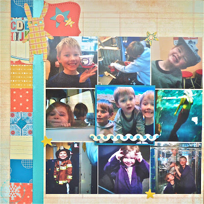
I knew I wanted to use these pics from the trip to the Children’s Museum that I took with my cousins and the boys. I even got so far as pulling out these fun DP’s I wanted to use, and then, just got stuck! So, I walked away from it, sometimes that is the best thing to do when you are struggling with a creative block.
2 days later I was feeling back on my crafty game, so I sat back down at the desk with the papers, and photos laid out. Started pulling ideas from my Inspiration Board on Pinterest…. Then I saw THIS awesome layout that I had pinned on there, and it even linked me up to a tutorial on the Laura Vegas blog on how to do the sunburst. I had actually made sunbursts before, you may remember this card…. But, this was a great tutorial for using multiple papers, which I was. So, I followed that. Also I used this sketch as a jumping off point, but obviously replaced the tree element with the sunburst.
I used the lined element of the DP to do my journaling on! It worked well and I didn’t need to make a separate journaling block, either. :)
I had so many fun papers that had these colors in them, even that background DP was lined with coral and sky colored lines. I found an old sheet of stickers that made great accents, perfect colors! I also used glitter tape between my “rays” on the sunburst, a good tip if you end up having a few ugly seams, since this technique is not an exact science. Additionally, you could stitch those seams or adhere ribbon or paper strips over them too…..
And now that you’ve been studying my seams, I bet you see my mistake too;) I missed taping one seam, and then ran out of tape! LOL, did you notice before I pointed it out? I kind of figured that the sunburst was pretty busy already and people might not notice, but I may end up picking up another roll of glitter tape at the crafts store next time so I can fix it!
On page 2, I punched squares of the different DP’s to create a border. I did the 9 panels of photos, leaving the center photo a bit largerand matting it. A few more stickers and my page was done!
hugs, Noelle
supply list: Designer Papers: My Mind's Eye, Die Cuts With a View, Sassafrass, TPC Studio, American Crafts; dies: Spellbinders and Sizzix for SU!; letter stickers: Simple Stories and October Afternoon; glitter tape: American Crafts; solid card stock: Stampin' Up!; stickers: Cosmo Cricket; ribbon: PTI (I think); label maker with yellow tape: Dymo; marker: SU!
DUST IT OFF!: Many oldie but goodies on this page! Lots of scraps and those Cosmo Cricket stickers are at least 2-3 years old:)


2 comments:
Noelle, cute cute cute. What a fantastic layout. So great in those colours.
WOW your layout is amazing...girl you are so awesome...love it..
Post a Comment