Hi, all! Did you miss me? Last time I'll be gone for awhile, I PROMISE! 3 trips in one month is about all I can handle, particularly since I normally don't travel that much. Had a wonderful girls' weekend in Las Vegas, though! A great time with some awesome friends: shopping, gambling having cocktails, hanging by the pool & sleeping in. Had a really nice dinner out at "Switch" (very cool atmosphere and wonderful food) and rented a limo that night. We even saw a Cirque de Soleil show from the light booth (for free)! I haven't been in a light booth since my college theater days, so that was really neat! What a cool perspective to see the show from. Gave the gals their girlfriend cards while I was there, too. :)
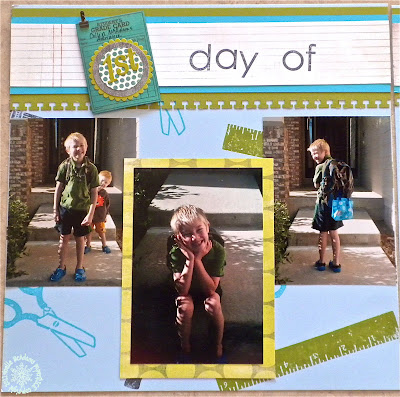
The boys headed back to school yesterday, so things should START to get back to normal 'round here! ;) I am looking forward to some more blog time. :) These pics are from LAST YEAR'S 1st day of school. I am not that speedy! ;)
So, this 2 page spread is for the fabulous color combo at this week's colourQ challenge! LOVIN' all these blues and greens! Here's the palette:
So, as you can see, I started with a Bashful Blue cardstock as my page "base." I used some really CUTE retired SU! stamps to background stamp the base pieces in the challenge colors. I created 2 border strips near the top with the solid Limeade and turquoise strips, and some DP that looked like notebook paper. I border punched the green piece with a punch that also looks like notebook paper. Then I stamped the title words out, using 2 different sets and a variety of ink colors. I cut a piece that looks like a report card from a piece of printed DP. But it was more aqua than turquoise in color, so I brayered some turquoise ink over the top to make it match. I did the same thing with the pennant stickers on the upper RH corner of the right page.
Now, a tip on color composition, and then I'll get back to the embellishments and layout. As you can see, I made the base page light blue, and that's the only light blue you see. I almost treated it like a neutral, see how it's the last real color you notice? Ok, so next you will notice, I made my accents using the gray, green and turquoise. I used a BALANCE of the three colors, contrasting one with the next, and really making the layers of vivid color play against each other. This gives the overall feel of the page a very lively, fun, kid-like mood. Now, IF I had been composing say, a wedding page with these colors, I would have gone mostly white, pale blue and green and only brought the bright green and turquoise in small doses and gone more tone on tone with my handmade embellishments for an ELEGANT, subtle feeling instead of a lively, kid friendly one. It IS important to think of the mood of your page as you lay out your colors. You don't need to use all the colors equally, and should think of how you want your project to feel. What kind of mood do you want to evoke with your page or card? You will be much happier with the end result if the feel comes off the way you want. :)
Ok, so embellishments: there's the report card piece I cut and brayered, then I added some stickers and punches circles to spell out "1st." I added the brayered pennant stickers on which I put stickers that read "2nd" for second grade. I added a date sticker and a button with twine to the o's in "school." Also added some glittery brads to the pennants. On the first page I matted my favorite, larger pic with some cute DP. On the right page, I added a punched macro shot of Collin, a journaling circle, and a layered embellishment I made. In the lower RH corner of that page is another layered embellie I made with another piece of the notebook paper DP and a variety of stickers.
Well, that's it for me today! I hope you like my page, I am really happy with the way it turned out. I will be back soon and I won't be leaving again for a while, I PROMISE! :) I really hope you'll come play with us at colourQ challenge this week! I would love to see how you use the colors and what you create with them!
xoxoxox, Noelle
supply list: solid cardstock, rubber stamps and ink pads: SU!; patterned papers: BasicGrey, My Mind's Eye, Crate Paper, October Afternoon; stickers: October Afternoon, My Mind's Eye, Crate Paper; punches: EK Success; button: Crate Paper; glitter brads: BoBunny; journaling circle: Jillibean Soup
DUST IT OFF!: Those stamps are several years old now, particularly the school ones, and oh-so-very cute, I'm pretty attached to those. And some of those stickers are too old for me to even identify! :)


1 comment:
Love your pages...wonderful layouts! Thank you for the tip about spreading the colors to fit the mood~ ;)
Post a Comment